
Forex trading for beginners Part 11: Trade Patterns

Forex trading for beginners Part 9: GRAPHIC PRICE MODELS

MATHEMATICAL ANALYSIS
MATHEMATICAL ANALYSIS, Types of indicators, Oscillators, Bearish convergence, Bullish divergence, Parallelism. MATHEMATICAL ANALYSIS, Indicators
Mathematical analysis, as a branch of technical analysis, began to be widely applied with the advent of the computer.
The ability to analyze a large number of charts for various markets, rapidly calculate multiple indicators, and modify them for different market situations determined the popularity of mathematical analysis among analysts in various financial markets.
Computer technical analysis is more objective than traditional chart analysis.
If one can argue about the presence of the “head and shoulders” pattern on the chart, one cannot argue about the direction of the indicator.
If it goes up, then it is definitely up.
If it goes down, then it is definitely down.
Indicators allow for a deeper assessment of the balance of power between bulls and bears in the market.
However, they also have a drawback: they often contradict each other.
Some are better at detecting trends, while others are better suited for horizontal trading ranges.
Some are excellent at signaling reversals, while others are better at tracing the direction of trends.
The analyst’s task is to select appropriate indicators for various market situations.
Before using an indicator, you need to have a clear understanding of what it measures and how to apply it.
Only then can you rely on its signals.
Types of indicators
Professionals divide indicators into two groups: trend-following indicators and oscillators.
Trend indicators are effective tools for analyzing a market that is moving either up or down.
But when the market is stagnant, their signals become unreliable and often false.
By contrast, oscillators are great at detecting changes in range-bound markets.
However, once a trend is established, oscillators can give premature or even false signals.
The secret to successful trading lies in the ability to combine indicators from different groups so that their drawbacks offset each other and their strengths are preserved.
Trend indicators include Moving Averages (Moving Averages – MA), Bollinger Bands (Bollinger Band – BB), Moving Average Convergence/Divergence (MACD), Moving Average of Oscillator (OsMA), and others.
These indicators give synchronous or delayed signals, i.e., simultaneously with or after a trend reversal.
Oscillators help identify turning points.
They include the Stochastic Oscillator (Stochastic Oscillator), Relative Strength Index (RSI), Commodity Channel Index (CCI), Inertia (Momentum), and others.
These indicators provide leading or synchronous signals and often appear before price changes.
With any trend, prices either gain, maintain, or lose momentum.
A decrease in the speed of an uptrend or downtrend is an early warning signal that the trend may be changing.
If, for example, an upward trend loses speed, this is a warning of a possible trend reversal.
Do you know?
The The X and The xCustomEA are the best Expert Advisors (EAs) for Forex.
They allow you to create your strategy from standard indicators and iCustom indicators and use our functions as an advisor.

EA The xCustomEA Universal trading advisor on iCustom indicators.

The X – Universal Advisor for Forex on Standard indicators.
Trend indicators
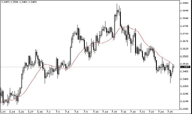
Moving averages (Moving Averages – MA)
Technical indicator Moving Average (MA) shows the average value of the instrument’s price over a certain period. When calculating the Moving Average, a mathematical averaging of the instrument’s price for a given period is performed. As the price changes, its average value either grows or falls.
The signal is calculated based on the mutual position of two Moving Averages, one with a shorter period (fast MA) and the other with a longer period (slow MA).
Their parameters can be specified in variables.
BUY signal is generated when the fast MA is above the slow MA.
SELL signal is generated when the slow MA is above the fast MA.
The “no signal” state is not used.

Moving averages (MA), being a simple tool for smoothing price series, make any trend more visible.
There are three main types of MA: simple (SMA), weighted (WMA), and exponential (EMA).
A simple Moving Average (SMA) is the average closing price of the last N candles, where N is called the period of the average.
It is calculated as the arithmetic mean.
For example, SMA = (sum of closing prices over the period) / N.
The advantage of a simple MA is its simplicity.
The disadvantage is that it assigns equal importance to all candles.
As the average is plotted near the last candle, it would be more logical to consider recent quotes as more important.
To address this drawback, Weighted Moving Averages (WMA) are used.
WMA = (sum of products of prices and weights) / (sum of weights).
In a WMA, more recent candles have greater weight, improving the indicator’s responsiveness and reducing lag.
However, there still remains some abrupt influence when old data is dropped.
This issue is eliminated by the Exponential Moving Average (EMA), which includes all the prices from the previous periods, not just a fixed range.
EMA is calculated by the formula: EMA = EMA(t-1) + K*(Price(t)-EMA(t-1)), where K=2/(N+1).
Here, N is the period of the average, and EMA(t-1) is the previous EMA value.
Choosing the correct averaging period is important.
A shorter MA reacts faster to price fluctuations but often provides more false signals.
A longer MA reacts more slowly but gives fewer false signals.
The trader’s task is to choose an MA period that meets the needs of the current trading strategy.
Typically, MA periods are chosen from the Fibonacci series: 8, 13, 21, 34, 55, 89, 144.
For shorter time frames, longer MA periods are often used, and for longer time frames, shorter periods can sometimes be effective, depending on the strategy.
If the cyclicity of the market can be determined, aligning the MA period with half of the dominant cycle can be beneficial, although market cycles can be unstable.
General rules for analyzing MAs:
1. Follow the direction of the MA. Trade in the direction of the MA. In an uptrend, the MA line can serve as a support level for buys. In a downtrend, it can act as a resistance level for sells.
2. Identify points of significant divergence between price and the MA. Large discrepancies can indicate potential corrections or reversals.
3. Identify points where the price crosses the MA. Such crossings can signal potential trend reversals.
Recommended MA periods:
| Price chart | MA periods |
| 5 days | 8, 13, 21 |
| 1 day | 8, 13, 21, 55, 89 |
| 3 hour | 8, 34, 55, 89, 144 |
| 1 hour | 5, 13, 34, 55, 89, 144 |
| less than 15 min. | 34, 55, 144 |
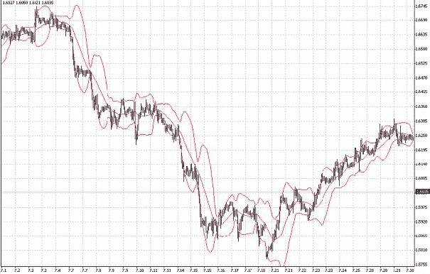
Bollinger band (Bollinger Band – BB)
Bollinger Bands (BB) are similar to Envelopes. The difference is that Envelope boundaries are a fixed distance from the MA, while BB boundaries are determined by standard deviations, which depend on volatility. As volatility increases, the bands widen, and as it decreases, they contract.
There are three types of signals:
BUY – The closing price of the previous candle is below the lower band.
SELL – The closing price of the previous candle is above the upper band.
“no signal” – The closing price of the candle is between the bands.

BBs are plotted as a band around an MA, with the width proportional to the standard deviation.
More than 95% of prices should lie within these bands if chosen correctly.
In an uptrend, the MA in the BB can act as support; in a downtrend, it can act as resistance.
When prices move from one band boundary, they tend to reach the opposite boundary.
Narrowing of the bands often precedes sharp price movements.
If prices break outside the band, it often indicates continuation of the current trend.
Peaks and troughs inside the bands, compared to those outside, can signal trend reversals.
Convergence of BB occurs when the market stabilizes. Divergence of BB often occurs when a new trend starts or an existing one strengthens.
Moving Average Convergence/Divergence (MACD)
The MACD is a dynamic trend indicator. It shows the relationship between two EMAs. MACD is effective in wide, oscillating markets. Its most commonly used signals are line crossovers, overbought/oversold conditions, and divergences.
MACD operates with four variables and provides simple signals:
BUY – The main MACD line is above the signal line.
SELL – The main MACD line is below the signal line.
“No signal” is not used.

The MACD consists of a fast line (the difference between two EMAs) and a slow line (the signal line, which is the MA of the MACD line).
When the fast line crosses above the slow line, it’s bullish; when it crosses below, it’s bearish.
If both lines are above zero, the market is bullish; below zero, bearish.
Divergences between MACD and price are significant signals. Bullish divergence suggests a weakening downtrend. Bearish convergence suggests a weakening uptrend.
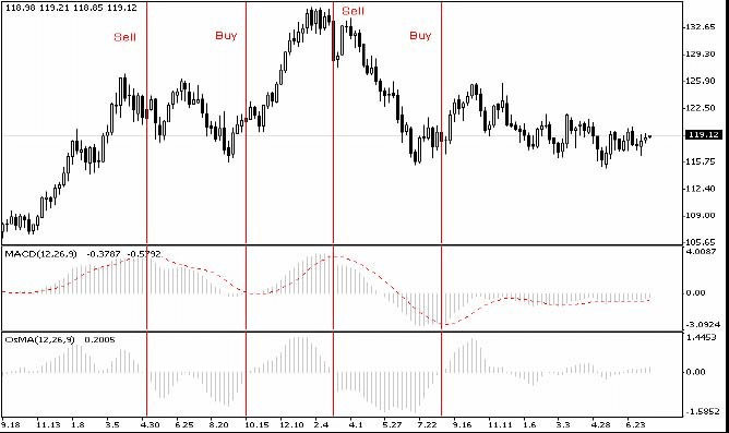
MACD standard parameters for the hourly chart are often 12, 26, and 9.
While traders sometimes try different parameters, constant optimization without a solid strategy can lead to poor results.
It should also be taken into account that the location of the lines above zero characterizes the market as bullish below zero – as bearish. The greater the values accepted by the MACD line in relation to the zero level, the stronger the corresponding stock sentiment.
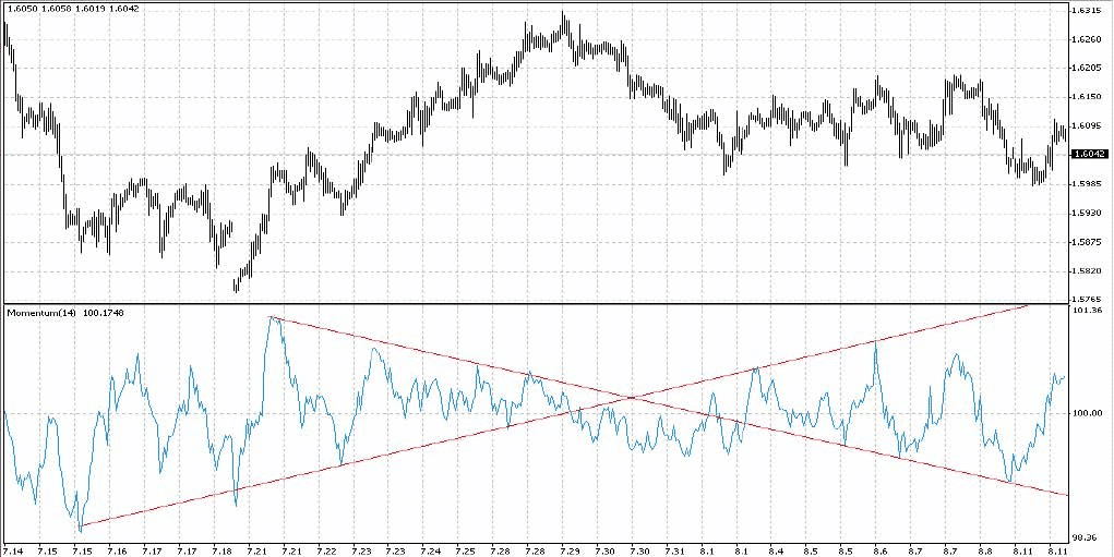
The most significant signals in the forecast plan are the so-called bullish divergence (divergence) or bearish convergence (convergence). Suppose we connect the two nearest extremums of the fast MACD line. In that case, two options are possible: either the direction of the straight line on the MACD coincides with the direction of the straight line connecting similar extremums on the price chart, or there are opposite directions of the corresponding lines. In the latter case, they speak of a bullish divergence (straight price up, straight MACD down) or bearish convergence (straight price down, straight MACD up)—a moment of the trend to reversal.
The meaning of divergence/convergence signals is quite transparent and is as follows. If the next MACD high on a bullish trend is lower than the previous one, this means that the result of the difference between the EMA of a smaller order and the EMA of a higher order began to decrease, i.e., The EMA of a smaller order came closer to the EMA of a higher order. Hence, the activity of the bulls decreased during this period. The explanation for this decrease in bullish activity may be different in different situations. Still, in general, it can be argued that everyone who wanted to buy on a bullish trend bought, and the entry of new traders into the market caused bulls to decrease. The price continued to move in accordance with the bullish trend only because the activity of the bears in this market was still lower than the activity of the bulls. Still, the gap began to narrow, and perhaps in the near future, the current trend will change direction.

| bullish divergence | bear convergence |
| a signal of either a reversal of the bullish trend, or its temporary attenuation | a signal of either a reversal of the bearish trend, or its temporary attenuation |
The standard parameters of the MACD indicator for the hourly chart are:
- – Fast EMA: 12 – EMA of a shorter period
- – Slow EMA: 26 – longer period EMA
- – MACD SMA: 9 – Signal, smoothing moving average
Many traders try to optimize the MACD by changing its parameters using other moving averages. The variants of 5, 34, and 7 are quite popular. Changing the parameters in order to obtain the desired (but not necessarily correct) signal is not a good practice. It can lead either to an increase in false signals or to a large delay in the applied signals. The parameters of the indicator are selected in accordance with the chosen trading strategy. Therefore, frequent optimization of the indicator will rather give you a signal that you do not have a trading strategy.
Histogram of moving average divergence (OsMA)
The OsMA (Moving Average of Oscillator) is the difference between the MACD line and its signal line. It is displayed as a histogram.
Signals differ slightly:
BUY – The histogram is above zero.
SELL – The histogram is below zero.
“No signal” occurs only when the OsMA is exactly zero.
OsMA provides deeper insights into bullish or bearish dominance.
If OsMA rises, bulls are gaining strength; if it falls, bears are gaining strength.
When OsMA diverges from price, it often signals potential reversals.
If price stays flat and OsMA returns to the midpoint, the prior trend often resumes.
Average Directional Movement Index (ADX)
The Average Directional Movement Index (ADX) helps determine whether a price is trending. Developed by J. Welles Wilder Jr., it evaluates trend strength, not direction.
Signal strategy from the directory:
If ADXLevel = 0, then:
Wilder suggests buying if +DI crosses above -DI and selling if +DI crosses below -DI.
If ADXLevel ≠ 0, then:
Buy when +DI > -DI and ADX > ADXLevel; Sell when -DI > +DI and ADX > ADXLevel.

The ADX system shows the strength of a trend.
+DI and -DI indicate whether bulls or bears are dominant.
If +DI > -DI, the trend is bullish; if -DI > +DI, the trend is bearish.
ADX measures trend strength. Low ADX indicates a weak or sideways market. Rising ADX indicates a strengthening trend.
When ADX is high, the market may be overheated, and caution is advised.
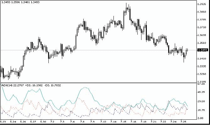
ADX works well on daily charts.
It clearly shows how much of today’s range extends beyond the previous day’s range.
Oscillators
Inertia (Momentum)
The inertia indicator allows you to monitor the pace of the trend – its acceleration, deceleration, or smooth progress.
Typically, these indicators reach a crest, bottom, or reversal before prices do.
While it is gaining altitude, you can safely hold bullish positions.
If it falls lower and lower, you can safely hold positions for the decline.
Having reached a new height, the signal indicates the acceleration of the upward trend and the likelihood of its continuation.
When turning around at a lower level, the signal shows that acceleration has stopped: the trend is now moving like a rocket running out of fuel.
Since it moves only by inertia, you should prepare for a possible reversal.
The situation with the bottoms of the indicator in downward trends is assessed using the same logic.
It is calculated simply as the change in price over a certain period.
Each price reflects the collective agreement of market participants at the time of the transaction.
The inertia is based on comparing today’s price (today’s value agreement) with the previous price (previous value agreement).
It measures changes in the level of collective optimism or pessimism.
If the momentum indicator reaches a new high, it reflects increased optimism in the market and the likelihood of further price growth.
If the momentum indicator falls to a new low, it indicates heightened pessimism and the possibility of further price declines.
If prices rise and momentum falls, it warns of an approaching peak: consider closing bull positions or tightening stops.
If prices reach a new high and the peak of inertia or rate-of-change is lower than the previous one, this divergence of peaks provides a strong SELL signal.
For downward trends, do the same but in the opposite direction.
In an upward trend, BUY whenever the momentum indicator falls below the zero line and then begins to rise.
If there is a downward trend, SELL when the momentum indicator rises above the zero line and then falls again.
On the inertia indicator’s chart, you can draw trend lines on the indicator itself.
A breakout of a trend line or a bounce from it can provide reliable signals to BUY or SELL.
Commodity Channel Index (CCI)
The technical indicator Commodity Channel Index (CCI) measures the deviation of the instrument’s price from its average statistical price. High values of CCI indicate that the price is unusually high compared to the average, and low values indicate it is too low. Despite its name, the Commodity Channel Index applies to any financial instrument, not just commodities.
Also, all three signals are used, but the default state remains “no signal“.
BUY – the intersection of the upper level from top to bottom
SELL – the intersection of the lower level from bottom to top
The value of external parameters CCIHighLevel and CCILowLevel determines the upper and lower levels.
The period and price used for calculation are determined by CCIPeriod and CCIPrice.

Normalizes the Momentum chart by dividing its value by the largest amplitude achieved:
CCI = [ X – SMA(X, n) ] / [0.015 x dX ], where X = [ Close + High + Low ] / 3,
- Close – closing price
- High and Low – maximum and minimum price for the analyzed period
- dX = Sum [ Xi – SMA(X, n) ] / n
- n – period length
- Xi is the price value at time i
- SMA(X, n) is the moving average for the period n.
Recommended n = 8.
The Commodity Channel Index (CCI) measures the deviation of a security’s price from its average price.
High index values indicate that the price is unusually high compared to the average, while low values indicate the price is unusually low.
Despite the name, CCI can be applied to any financial instrument, not just commodities.
There are two main ways to use the CCI:
To find divergences
A divergence occurs when the price makes a new high, but CCI does not exceed its previous high.
This classic divergence often precedes a price correction.
As an overbought/oversold indicator, the CCI usually fluctuates in the ±100 range.
Values above +100 indicate overbought conditions (and a possible corrective decline), while values below -100 indicate oversold conditions (and a possible corrective rise).
Relative Strength Index (RSI)
The technical indicator Relative Strength Index (RSI) is another oscillator ranging from 0 to 100. W. Wilder recommended using a 14-period RSI. Later, 9- and 25-period variants also gained popularity. One of the most common methods of analyzing the RSI is to look for divergences where the price makes a new high, but the RSI cannot surpass its previous high. This divergence signals a possible price reversal. If the RSI then turns down and falls below its previous trough, it forms a “failure swing,” considered confirmation of an impending price reversal.
Similar to CCI and DeMarker, RSI signals occur when exiting overbought (RSIHighLevel) and oversold zones (RSILowLevel).
BUY signal appears when RSI rises from a lower value, crossing (RSILowLevel).
SELL signal appears when RSI moves down from a higher value, crossing RSIHighLevel.
The default state is “no signal“.
The RSI period is set in RSIPeriod, and the calculation price is set in RSIPrice.

Developed by J. Wheeler Jr. in 1978, RSI is now one of the most popular oscillators.
RSI = 100 – [ 100 / (1 + RS) ], where RS = AUx / ADx, x is the number of days in the analysis period (RSI order), recommended 8.
AUx is the sum of positive price changes for the period, ADx is the sum of negative price changes for the period.
The recommended order is 8 (for any period).
The author originally used 14 as it was primarily applied on daily charts.
The RSI is a price-following oscillator ranging from 0 to 100.
A common analysis method is to look for divergences: when the price makes a new high but the RSI does not.
Such divergences suggest a potential price reversal.
If the RSI then turns down and falls below its trough, it completes a ‘failure swing’, confirming a likely reversal.
How to use RSI for chart analysis:
Tops and bottoms
RSI tops typically form above 70 and bottoms below 30, and they usually precede tops and bottoms on the price chart.
Chart Patterns
RSI often forms chart patterns – such as ‘head and shoulders’ or triangles – that may not appear on a price chart.
A failed swing (breakout of support or resistance level) occurs when the RSI rises above a previous high (peak) or falls below a previous low (trough).
Support and Resistance Levels
On the RSI chart, support and resistance levels appear even more clearly than on the price chart.
Divergences
As mentioned above, divergences are formed when the price makes a new high (low), but it is not confirmed by a new high (low) on the RSI chart.
In this case, prices usually correct in the direction of the RSI movement.
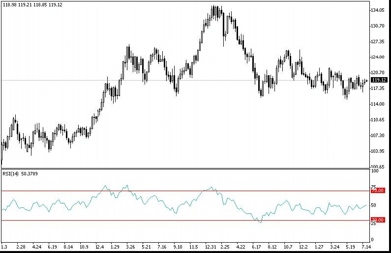
The same methods are used to analyze them when analyzing average prices on a chart.
The advantage is that RSI fluctuations are limited and that signals from the RSI averages may outstrip the signals from the chart averages.
Parabolic SAR
The Parabolic SAR indicator is plotted on the price chart.
It is conceptually similar to a moving average, but the Parabolic SAR moves with greater acceleration.
This indicator is often used as a moving stop line signal.
The Parabolic system is excellent for identifying market exit points.
Long positions should be closed when the price falls below the SAR line, and short positions should be closed when the price rises above it.
If you hold a long position (the price is above the SAR line), the SAR line will move up regardless of price direction.
The amount the SAR line moves depends on the magnitude of the price movement.
Williams’ Percent Range (%R)
Technical Indicator Williams` Percent Range (%R) is a dynamic indicator that determines the state of overbought/oversold. Williams` Percent Range is very similar to the Stochastic Oscillator. The difference between them is only that the first has an inverted scale, and the second one is constructed using internal smoothing.
Williams’ Percent Range Technical Indicator (%R) is very similar to the Stochastic Oscillator. Values between -80% and -100% indicate oversold conditions, and values between -0% and -20% indicate overbought conditions. A minus sign is placed before the values (e.g. -30%) to invert the scale. Ignore the minus sign during analysis (MetaTrader 5).
It is similar to RSI, CCI, and DeMarker.
Signal BUY – the intersection of the level of overbought (WPRHighLevel) from top to bottom
Signal SELL – the intersection of the oversold level (WPRLowLevel) from the bottom up.
All the rest is “no signal“.
Only the parameter of the indicator period can be changed from outside – WPRPeriod.
Williams’ Percent Range (%R) is a dynamic indicator that determines overbought/oversold conditions.
The (%R) indicator is very similar to the Stochastic Oscillator.
The only difference is that the first has an inverted scale, and the second is constructed using internal smoothing.
To construct the %R indicator on an inverted scale, its values are usually assigned a negative sign (for example -30%).
When analyzing, the negative sign can be ignored.
Indicator values range from 80 to 100%, indicating oversold conditions.
Values in the range from 0 to 20% indicate that the market is overbought.
According to the rule common to all overbought/oversold indicators, it is best to act on their signals by waiting for prices to turn in the appropriate direction.
If the indicator overbought/oversold indicates an overbought state, then before selling the security, it is reasonable to wait for prices to turn downward.
The %R indicator has a curious ability to anticipate price reversals.
It almost always peaks and turns down before prices do, and likewise forms a trough and turns upward in advance.
Rules for oscillator analysis:
- Values following the oscillator’s max or min warn of a trade. Wait for at least two confirmations.
- Intersection with a defined boundary of upper/lower values: time to trade. For sells or buys, at least one confirmation.
- Intersection with the middle: you may be late, so wait for at least two confirmations.
- In a bullish market, raise the value limits; in a bearish market, lower them.
- Oscillator analysis works well in a flat (sideways) market.
- If during a strong upward trend the oscillator shows downward movement but the price does not follow, the upward trend may strengthen further; the opposite applies in a strong downward trend.
- When the trend changes, the oscillator can be misleading or be the first to warn.
- Consider how oscillators interact with the price chart (in the figures, the price is above, and the oscillator below).
Bearish Convergence

1. Medium signal. If the end of the Oscillator is close to the upper limit, then a price decrease is possible; if it is near the middle, the exchange rate may stabilize.
2. Weak signal. We expect price stabilization followed by a change in trend.
3. Medium signal. If the end of the Oscillator is close to the upper limit, the trend may strengthen; if it is near the bottom, then an increase is likely; if it is near the middle, both a fall and price stabilization are equally likely.
Bullish Divergence
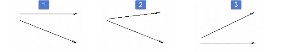
1. Medium signal. If the end of the Oscillator is close to the lower boundary, the price may rise; if it is near the middle, depreciation is more likely.
2. Strong signal. We expect price stabilization followed by a trend change.
3. Medium signal. If the end of the Oscillator is close to the lower border, the trend may strengthen; if it is near the top, then stabilization is possible; if it is near the middle, both price growth and stabilization are equally likely.
Parallelism

Average signal.
1. Strong upward trend.
2. Expect a trend change.
3. Strong downward trend.
Final remarks.
When operating in a strong trend, treat oscillator signals with caution. False oscillator signals often indicate trend strengthening.
If the trend is upward, oscillators remain in the overbought zone most of the time; if downward, they remain in the oversold zone.
Basic rules for volume analysis:
- A decrease in volume – reduced interest in current exchange rate dynamics, a possible trend change, or temporary price stabilization.
- An increase in volume – increased interest in current exchange rate dynamics, strengthening of the current movement, or the emergence of a new price direction.
- Sometimes a gradual decrease in volume accompanies a sharp price change.
- Volume peaks signal a possible trend reversal.
Plotting Japanese candlestick charts and analyzing candlestick patterns is a relatively new area of technical analysis.
The advantage of Japanese candlesticks is that they visually represent data, making it possible to see internal relationships. They create a clear psychological picture of trading.
Japanese candlesticks show short-term market sentiment rather than underlying causes. They fall under technical analysis. Investor emotions like fear, greed, and hope influence prices. The general psychological atmosphere cannot be measured statistically, so technical analysis helps assess changes in psychology.
Japanese candlesticks record shifts in investors’ perception of value, reflected in price movements. They reveal how buyers and sellers interact.
Below is a brief overview of candlestick patterns for reference, as their full versatility cannot be fully covered here.
Explore the Best Forex Tools and Guides on Expforex.com
Expforex.com provides a range of powerful tools and comprehensive guides for Forex traders, ideal for both beginners and professionals. Here’s a quick overview of some top resources:
- EA The xCustomEA: Universal Trading Advisor
Build your custom strategy with this universal Expert Advisor (EA) for iCustom indicators. Perfect for traders who want a tailored approach. Learn more. - The X – Universal Expert Advisor
A robust EA leveraging standard indicators and offering versatility for diverse trading scenarios. Explore features. - Averager: Smart Averaging Tool
Manage trades efficiently by opening deals with and against the trend. A must-have for precise position averaging. Details here. - Extra Report Pad – Trader’s Diary
Analyze your trading account like a pro with real-time insights and visualized reports. Integrates seamlessly with MyFxBook. Discover more. - CLP: CloseIfProfitorLoss
Monitor and control total profit or loss with trailing functionality. Enhance your risk management strategies. Check it out. - SafetyLOCK PRO: Lock and Hedge Positions
Protect your trades by locking positions with opposite pending orders. An essential tool for minimizing risk. Learn how. - Forex Glossary – Essential Concepts
Familiarize yourself with key Forex terminology to enhance your trading knowledge. Browse the glossary. - Forex for Beginners Series
Dive into a step-by-step guide to Forex trading, covering everything from financial markets to trade patterns. Ideal for novices. Start learning. - Functional Features of Experts
Explore the unique capabilities and parameters of Expert Advisors (EAs) developed by Expforex. Read more. - Testing and Optimization for EAs
Maximize performance with advanced testing and optimization methods for Expert Advisors. See details.
These tools and guides help traders improve their skills and strategies, making Expforex.com a go-to resource for Forex enthusiasts.
You can read other chapters.

Forex trading for beginners Part 9: GRAPHIC PRICE MODELS
GRAPHIC PRICE MODELS, REVERSAL MODELS, CONTINUATION PATTERNS, REVERSAL-CONTINUATION PATTERNS

Forex trading for beginners Part 11: Trade Patterns
Reversal patterns, Stars, Hammer and Hanging Man, Other reversal patterns, Trend continuation patterns. The main provisions of Japanese technical analysis: Gap play from price highs and lows