
Forex trading for beginners Part 10: MATHEMATICAL ANALYSIS, Indicators

Forex trading for beginners Part 8: Trendlines

GRAPHIC PRICE MODELS
It would be a mistake to assume that any change in the dynamics of the trend can happen instantly, as if by magic. GRAPHIC PRICE MODELS, REVERSE MODELS., CONTINUATION PATTERNS, PATTERNS OF CONTINUE REVERSAL,
Major market changes usually require a transition period.
The point, however, is that a trend reversal does not always follow such periods.
Sometimes, they can mean a pause or some consolidation, after which the development of the existing trend will continue again.
Combinations of different lines and levels of resistance and support, channel lines, and trend lines form the so-called graphical price models, which analysts traditionally use to predict the future exchange rate.
Graphical price models allow you to predict the fate of a trend: its continuation or reversal. A price pattern is a movement wherein the lines connecting its key moments form certain geometric outlines or figures.
Most often, the key points in developing price patterns are significant price peaks and falls.
All price models are divided into fracture (reversal) models and trend continuation models. Some of the patterns can be both continuation and reversal patterns simultaneously.
Continuation patterns indicate that the market has paused. Perhaps the trend developed too quickly and temporarily entered into a state of overbought or oversold.
Then, after an intermediate correction, it will continue growing in the same direction.
Another criterion for the difference between reversal and trend continuation patterns is the duration of their formation. The construction of the first ones, which show dramatic changes in price dynamics, usually takes more time.
As for the trend continuation patterns, they are shorter. It would be more correct to call them short-term or intermediate.
Notice how often we use the word “usually”. This is because the interpretation of graphical models is subject to general patterns rather than strict rules. There are always exceptions.
One must always remember that continuation patterns are superior to reversal patterns because the current trend is more likely to continue than to change direction (see Fundamental Principles of Technical Analysis).
If several graphical models simultaneously give similar signals, they confirm each other, and you can safely work in the direction the models indicate.
REVERSE MODELS.
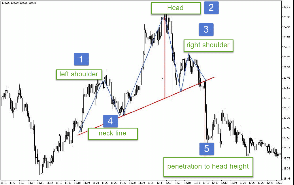
“Head and Shoulders” – confirm the trend reversal.
This is one of the most well-known trend reversal patterns and is essentially the main one. All other reversal patterns are just special cases of this pattern.
The head and shoulders price pattern indicates the end of an uptrend and consists of three parts: a head high, two lower crests, and the shoulders.
This line is not always horizontal; it can ascend and descend. A descending neckline is a clear sign that the bears are gaining strength and only reinforcing the value of the price pattern.
If prices fail to rise above their heads, this confirms a head and shoulders formation. The right shoulder may be higher or lower, wider or narrower than the left.
The fall in prices from the right shoulder with the neckline breakdown marks the end of the uptrend.
Having broken through the neckline, prices sometimes return to it on a small volume. This rise creates excellent shorting conditions with a suspension just above the neckline.
Generally, a head and shoulders pattern is considered complete when the closing results decisively break down the neckline.
In the head and shoulders ridge model, volume is extremely important. It is crucial to analyze volume values because this will cut off this model’s false appearances in time.
As a rule, the volume of the left shoulder is larger than the volume of the head. This is not a necessary condition; rather, it is a pattern and the first warning signal of a decrease in buyer pressure. The most important signal is the volume value, which coincides with the third peak (the right “shoulder“). The volume should be much less here than in the other two cases.
Then, the trading volume rises again when the neckline is broken, falls during a possible return move, and increases again after the return move is completed.
This model is a good starting point for determining the minimum price target for further price movement. The minimum rate movement potential after breaking through the neckline is usually equal to the height of the price model’s head, measured from the drawn neckline.
Knowing the minimum price target is extremely important because it allows you to evaluate the expected dynamics of the market and the degree of risk when opening a position in this direction.
In the future, several factors must be considered when determining price targets. The way we discussed above when discussing the head and shoulders pattern is the first step.
There are many other technical factors to consider. For example, where are the important support levels formed by the intermediate dips in the previous uptrend? The fact is that, as a rule, the downward trend “freezes” precisely at these levels. The next important factor is the correction length percentages. We know that the maximum length of a downtrend is typically 100% of the distance that prices traveled during the previous bull market.
But where are the correction levels located? After all, at these levels, there are usually areas of strong support below the market.
Price gaps are also important if they occur during the previous growth.
They also often serve as support. We should also not forget long-term trend lines if they are below the market.
When the Head and Shoulders pattern does not lead to a fall, it is often followed by a massive upswing.
All of the above is true for an inverted Head and Shoulders pattern, only in a bear market. This price pattern is formed when a downtrend, having lost strength, is about to reverse.
There is, however, a very serious difference between these two models, which lies in the dynamics of the trading volume.
In general, volume plays a much more important role in defining and completing a head and shoulders pattern at a market bottom than at a market top. Here, to start a new upward trend, a significant increase in pressure from buyers is required, manifested in an increase in trading volume.
In the first half of bull market patterns and bear market patterns, the main dynamics of trading volume are almost the same; that is, the volume that falls on the “head” point, as a rule, is always slightly less than the volume that falls on the left “shoulder“.
But then the picture changes somewhat.
For models in a bear market, the rise in prices from the point of the “head” should be accompanied not only by an increase in business activity but, very often, its level overlaps the volume indicator attributable to the previous surge from the point of the left “shoulder“.
The decline to the end of the right “shoulder” should entail a decrease in volume and a very significant one. The most critical moment, of course, falls on the breakout point of the neckline.
A genuine explosion of trading activity must accompany this signal.
- Left shoulder
- HEAD
- Right shoulder
- Neckline
- Penetration to Head Height
This is the essential difference between a top pattern and an inverted or bottom pattern.
In a bullish trend, in a bearish trend
Good position to open down
Good Position to Open Up
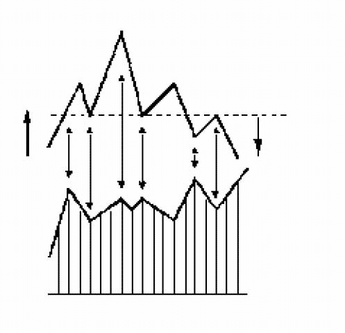
Figure Features:
- If an inverted G-P pattern appears in a bearish trend, then a higher second shoulder strengthens its signal.
- If, in a bullish trend, the second shoulder of the “G-P” is lower than the first, this also enhances the signal.
- To recognize the “G-P” figure, compare it with volume indicators.
- The potential of the course movement after breaking through the neckline is usually equal to the height of the “head” – X.
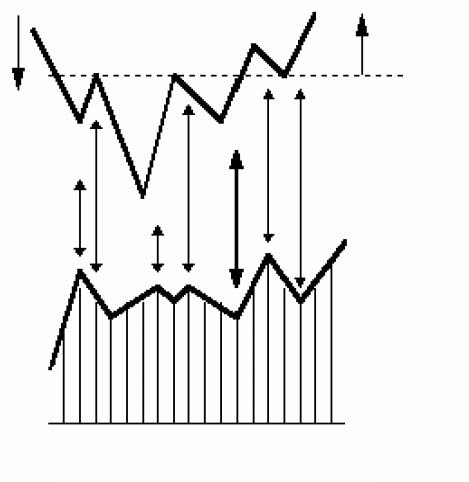
Triple Top and Triple Bottom
The triple top or bottom pattern is rarer than the head and shoulders pattern and is just a variation.
The main difference is that all three peaks (or three lows) at a triple top or bottom are almost at the same level. But in fact, both models are almost the same.
Many of the points discussed about the head and shoulders pattern also apply to other reversal patterns.
In a top pattern, trading volume tends to decrease with each successive peak and should increase at the breakout point. The pattern is not considered complete until the support levels under the previous two declines are broken.
Accordingly, in the case of the model, the triple bottom of the closing price should break through the resistance level, passing above the two previous peaks.
Only then is the pattern complete (as an alternative strategy, a breakout of the nearest high or low level can be considered a trend reversal signal). A very important factor for completing the bottom pattern is increased trading volume.
The method of determining price targets is similar to that used for the “head and shoulders” model. It is based on the height of the model.
The minimum distance that prices travel from the breakout point is usually equal to the pattern’s height. After a breakout occurs, prices often reach the level of the breakout during the retracement process.
As you can see, triple tops and triple bottoms are, in fact, just variants of the head and shoulders pattern, so there is hardly any point in dwelling on them in more detail.
| Good position to open down after receiving 1 confirmation | Good position to open up after receiving 1 confirmation |
Double Top and Double Bottom
This trend reversal pattern is much more common than the previous one. After the head-shoulders model, it is the most common and recognizable.
The general characteristics of the Double Top pattern are the same as those of the Head and Shoulders and Triple Top patterns, with one exception: this pattern has two peaks rather than three.
These peaks are usually located at the same level, but there may be cases when the second peak is above or below the first.
The volume changes accompanying the formation of a double top and how it is measured are similar to those we considered earlier.
In an uptrend, prices set a new high, usually accompanied by increased trading volume. Then, there is an intermediate decline, and the volume also falls.
So far, everything is going well, as in a normal uptrend. However, during the next rally, prices failed to overcome the level of the previous peak in terms of values at the time of the close, and they began to fall.
As a result, we have a potential double-top pattern. Potential because, as with all reversal patterns, the reversal is incomplete until closing prices cross the previous support level.
The “Head and Shoulders” pattern uses the neckline level, and for the “Double Top” pattern in question, this is the minimum drop between the two tops. And while this has not happened, it is too early to talk about a trend reversal.
Ideally, this top pattern should have two clearly defined peaks at the same level. As a rule, the first peak is characterized by a large trading volume, and the second is characterized by a smaller one.
A decisive break of the closing prices of the recession level between the two peaks, with an increase in volume, suggests the completion of the pattern and, therefore, a reversal of the trend to the downside.
Prices may return to the level of a breakthrough, after which a downward trend will continue.
Determination of the price low after the breakout of the support line is based on the same pattern height, i.e., the distance from the pattern’s price decline to the high of its first top.
This distance is plotted down from the breakout point of the support level.
The analysis methods for the “Double Bottom” models are similar; only the model’s height is plotted in the opposite direction.
“Double Top” and “Double Bottom” have become overused. Many potential double tops or bottoms often end up being something else entirely.
This is explained by the feature of price dynamics already known to us: having come across the previous peak during growth or the level of the last recession during the fall, prices sometimes cannot overcome them immediately. In this case, prices may roll back in the direction opposite to the prevailing trend.
Such price behavior is natural and is no signal of a trend reversal. Again, to speak of a double-top pattern, prices must overcome the level of the previous intermediate decline. Only then does the model cease to be potential.
The analyst is indeed faced with a difficult task: recognizing whether a pullback from a previous peak level or a rebound from a declining level is only a temporary correction of an existing trend or the beginning of a double top or double bottom reversal pattern.
According to one of the postulates of technical analysis, the trend is valid until it shows clear signs of a turning point.
Therefore, before taking any action, it would be wiser to wait for the full completion of this fracture model.
For a more accurate identification of the figures, “Double Top” and “Double Bottom”, so-called technical indicators are used.
Differences often appear at these points. Their application will be considered in more detail in the section on mathematical analysis.
Conducting transactions based on a competent analysis of the figures “Double Top” and “Double Bottom” are among the most profitable trading options.
| Good position to open down after receiving 1 confirmation | Good position to open up after receiving 1 confirmation |
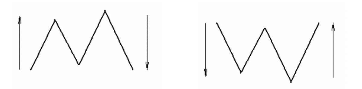
V-Shaped Top and Base (“Spike”)
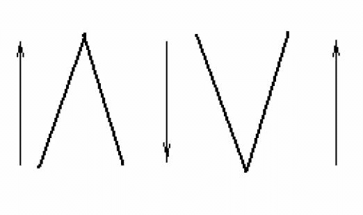
The model is formed, as a rule, after a rapid previous trend. The chart has many gaps; there are almost no resistance/support levels.
A trend reversal is formed in the form of a key day or an island reversal. The only signal for a trader can be a break of a very steep trendline.
CONTINUATION PATTERNS
Continuation patterns mean that the price stagnation period shown on the chart is nothing more than a pause in the mainstream’s development and that the trend’s direction will remain unchanged after it ends.
This is how they differ from the main trend reversal models. And, of course, as noted earlier, the duration of the formation of trend continuation patterns is usually less than that of trend reversal patterns.
Flag and Pennant Models.
Due to their similarities, the flag and pennant models are usually considered together. These configurations are formed on the same segment of the trend’s development, corresponding to the same trade volume indicators. Finally, the methods of measuring them are also similar.
Flag and pennant patterns mark brief pauses in a dynamic trend. The formation of these patterns on the chart should be preceded by a steep and almost straight line of price movement.
Both figures denote markets that, in their development up or down, seem to overextend themselves and, therefore, must stop and rest for a while before continuing to move in the same direction.
Flags and pennants are among the most reliable continuation patterns. The reversal of the trend on these models is very rare. It is characterized by a rapid rise in prices, combined with high volume, preceding the appearance of the pattern.
A sharp decrease in activity as they form signals the entry of the market into a consolidation phase. The activity rises rapidly when the trend line is broken towards continuing the previous trend.
The construction of these two models is almost the same. The flag resembles a parallelogram or rectangle bounded by two parallel trend lines sloping against the movement of the prevailing trend. In a downtrend, the flag should be slightly up.
Two converging trend lines and a more horizontal arrangement can identify a pennant pattern. The pennant resembles a small symmetrical triangle. Both patterns are formed against a gradual but significant decline in trading volume.
Both models are relatively short-lived. Prices take less time to form with a falling trend than with an uptrend.
The methods of measuring the minimum price targets after the completion of the figure (breakout moment) are the same for both models.
The sharp rise or fall in prices that precedes flag and pennant patterns is often called a “flagpole”.
Usually, the price movement after the trend resumption will cover a distance equal to the length of the “flagpole” or the size of the price move that preceded the pattern formation.
- Top 1
- Top 2
- Figure “Pennant”
- Double Top Pattern
- Top size
- Shaft
- The movement potential is equal to the value of the “Flagpole.”
- The movement potential is equal to the “Shaft” value.
- Figure “Pennant”
- The movement potential is similar to the “Shaft” value.
PATTERNS OF CONTINUATION AND REVERSAL
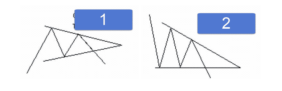
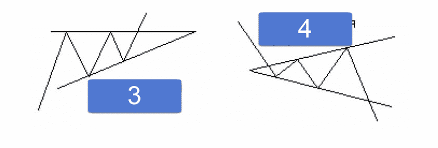
Triangles
A triangle is an area whose top and bottom borders converge on the right side. It can be a reversal pattern, but more often a trend continuation pattern.
A continuation pattern usually becomes a narrow triangle with a height of 10-15% of the size of the previous trend. Large triangles, one-third or more of the size of the last trend, are more likely to become trend reversal patterns. Some triangles just enter playing ranges.
There are three types of triangles: symmetrical, ascending, and descending. Sometimes, a fourth type is also distinguished – an expanding triangle or an expanding formation. The upper and lower boundaries converge on the left side.
Symmetrical (isosceles) triangles reflect a stable balance of forces between bulls and bears and are most often trend continuation patterns.
Completing the triangle model requires the time determined by the point of convergence of the two lines, i.e., the top of the model.
Typically, a breakout occurs in the direction of the previous trend at a distance of 1/2 to 3/4 of the horizontal width of the triangle. If prices remain inside the triangle beyond a point 3/4 of the width away, the pattern begins to lose its potential.
The signal about the completion of the model is given by the exit of the closing price beyond one of the trend lines.
As the boundaries of price fluctuations narrow within the triangle, the trade volume should decrease. This trend is true for all consolidation patterns.
But it should rise significantly after the trend line crosses, completing the pattern. If, when prices rise to the upper boundary, the volume jumps, then an upper breakout is most likely to occur, and vice versa. If it increases when prices fall, then a breakout will occur downwards.
True breakouts usually occur in the first two-thirds of the triangle. It is better not to trade during breakouts in the last third.
An ascending triangle has a relatively horizontal upper edge and an upwardly directed lower edge. The horizontal top shows that the bulls are still strong and can pull prices to a new level, while the bears, weakening, cannot lower them. Such a triangle often ends with a breakout upwards (this pattern is called bullish).
A bullish breakout is a sharp exit of the closing price from the upper trend line. The return move to the support line (horizontal top line) is uncommon and accompanied by negligible volume.
Although the ascending triangle pattern is most commonly seen in an uptrend and is considered a continuation pattern, it is also sometimes seen as a reversal pattern at the bottom of the market. You can notice the formation of an ascending triangle at the end of a downtrend. In this case, a break of the upper trend line signals the completion of a bottom pattern and is considered a bullish signal.
The descending triangle is a mirror image of the ascending one. It has a relatively horizontal bottom edge and a downward-facing top. This shows that the bears are still strong and continue to reduce prices, while the bulls, weakening, cannot lift them.
A descending triangle often leads to a downside breakout. The completion of the model occurs under the same conditions as for other triangle models.
Such a triangle can also form at the top of the market. In this case, if the closing price is below the horizontal lower line, then a signal is received about a reversal of the main upward trend downwards.
During the formation of triangles, you can notice upward fluctuations in volume during price jumps (ascending triangle) and its decrease during short-term price drops.
As the triangles age, the volume of trades tends to decrease. If the volume jumps as it rises to the upper boundary, then an upper breakout is likely. True breakouts are usually accompanied by a jump in volume – at least half the average volume of the last few periods.
When working with a symmetrical triangle, there are two ways to calculate the minimum price targets. From the beginning, the height of the widest part of the pattern (the base) is measured, and this distance is plotted vertically upwards, either from the breakout point or from the top.
It should be noted that if the analyzed triangle is small and arose in the midst of an assertive trend, this price target is often exceeded and, by the method of definition, approaches the price target of the pennant figure.
In addition to standard triangles, there is a model of expanding triangles (inverted). This pattern builds in reverse order, i.e., the trend lines diverge.
The appearance of such a formation indicates that the market is becoming uncontrollable; traders’ actions are subject to emotions rather than common sense. Volume changes in the opposite direction to a simple triangle.
It often appears at the top of the market, so the expanding triangle is a bearish pattern. It ends and signals the beginning of the main downtrend when the price movement from the third peak crosses the level of the second recession.
After the pattern is completed, prices may reverse up to 50% of the previous segment of price movement down, after which the bearish trend resumes. With this model, the expansion of price fluctuations is accompanied by a gradual increase in trading activity.
| 1 Symmetrical Triangle | 2 Descending Triangle |
| 3 Ascending Triangle | 4 Divergent Triangle |
General Rules for Analyzing Triangles:
- In a classic triangle, there should be five touches from the moment you enter the triangle (three down and two up or vice versa).
- If the price enters from above, then a stronger position to continue the price down.
- If the price enters from below, then a stronger position to continue the price up.
- If the angle of the triangle is directed upwards, then the price is more likely to go up.
Rectangle Model
This is a graphical model that shows price movements between two parallel lines. They are usually horizontal but can be ascending or descending.
They can be patterns of trend continuation or reversal. The rectangle indicates the balance of power between bulls and bears. The pattern in question is very similar to a Triple Top.
If volume increases as prices approach the upper border of the rectangle, then an upward breakout is likely. Still, a downward breakout is expected if it grows as it comes to the lower border. When prices break out of the rectangle, volume usually increases.
A breakout on low volume is most likely false.
Rectangles tend to be wider for uptrends and narrower for downtrends. The longer the rectangle, the more significant the breakthrough from it.
The probable target of a breakthrough from a rectangle is equal to the height of the rectangle itself laid down from the location of the breakthrough.
This is the minimum price target. However, it is believed that the longer a rectangle is formed, the greater the potential for movement after a breakout. Therefore, it is thought that the maximum target, in this case, will be the actual length of the rectangle laid down from the breakout point in the direction of the developing trend.
A special case of the rectangle price pattern is the line price figure, which differs from the rectangle only in height, about 3% of the size of the previous trend.
If, during a break, the market does not go in a different direction but only threatens to align, this indicates a particularly strong underlying trend.
Trading tactics in the above graphical rectangle model may be different, but the following rules will be common:
When buying at the bottom border of the rectangle, place a protective stop just below it.
When shorting near the top border of the rectangle, place a protective stop just above this border.
Close the position at the first sign of a reversal.
It is risky to wait until prices move a few more points within the rectangle.
To determine the likelihood of an upper or lower breakout, analyze the market on a larger time scale than the one you are trading on.
The trend of the daily chart takes precedence over the trend of the four-hour chart, etc. Place a protective stop inside the rectangle when buying after an upper breakout or selling short after a lower breakout.
Prices may return to the border of the rectangle on low volume but after a true breakout into the rectangle, they will not go deeper.
A false breakout in any direction will be a strong signal to open positions in the direction opposite to the false breakout.
Diamond (Diamond Formation)
The “diamond formation” is a relatively rare pattern that forms at the top of the market. The peculiarity of this configuration is that it combines two different triangle models – expanding and symmetrical.
The first half of the “diamond formation” has the outline of an expanding triangle, and the second is symmetrical.
The volume dynamics generally correspond to the price dynamics: in the first half of the formation, the volume increases, and then, as price fluctuations decrease in the second half, it decreases.
Trend lines that first diverge and then converge form a graphic pattern resembling a diamond. This is where the name of the model comes from.
This is a relatively rare model; it occurs when the market reaches its top. It is often a trend reversal model and occasionally a trend continuation model.
The diamond pattern ends with a breakout of the ascending trend line in the second half of the formation, which usually increases trading activity.
The technique for measuring minimum price targets when breaking through a diamond pattern is similar to the described methods for measuring triangle patterns.
The distance is measured strictly vertically at the widest part of the pattern and then projected downward from the breakout point. Sometimes, there is a return movement of prices, similar to breakouts of strong lines, after which the trend towards the breakout resumes.
Wedge
The wedge model resembles a symmetrical triangle in terms of shape and duration of formation.
Like the triangle pattern, the wedge is easily recognized by the two trend lines converging at its apex.
The wedge model has a significant slope – up or down.
Typically, like a flag, the wedge is angled against the direction of the prevailing trend. Thus, a wedge pointing down is considered a bullish pattern, and a wedge pointing up is considered bearish.
Wedges are often formed during the development of an existing trend and, as a rule, are continuation patterns. They can also start at the top or bottom of the market, signaling an imminent trend reversal. However, this happens very rarely.
But regardless of where this pattern is formed – in the middle or at the end of the price movement segment – you must always be guided by the rule that an upward wedge is a bearish pattern, and a downward wedge is a bullish one.
Typically, such a model can go all the way to the top. As the wedge forms, the volume should decrease and then, upon breakthrough, increase.
Top Tools for MetaTrader Traders
MetaTrader users are constantly on the lookout for tools that can simplify trading and improve results. Our curated list of top tools provides both beginners and experienced traders with effective solutions for automated trading, trade management, and strategy optimization.
For traders looking for a powerful automatic trading solution, the AI Sniper is an excellent choice. It uses smart algorithms to identify optimal trades. If you prefer manual control with quick execution, the VirtualTradePad (VTP) Trading Panel allows you to trade directly from the chart with one click.
Copy trading enthusiasts will appreciate Copylot, which enables seamless trade duplication between MetaTrader terminals. For those wanting to build custom strategies, the xCustomEA is a universal trading advisor that integrates with custom indicators.
If scalping is your preferred trading style, the TickSniper offers precise and automated tick-based trading. Similarly, the The X Expert Advisor leverages standard indicators for universal trading strategies.
To support open positions, the Assistant provides tools for managing StopLoss, TakeProfit, and trailing stops effectively. For traders focused on analyzing their accounts, the Extra Report Pad acts as a professional trading diary with live analytics.
Finally, the Duplicator simplifies the duplication of deals across multiple MetaTrader terminals, making it indispensable for multi-account management.
Explore these tools to elevate your trading experience and achieve your goals with ease!
You Can Read Other Chapters

Forex trading for beginners Part 8: Trendlines
Trend lines and channel lines, Building trendlines (Trendlines), Building and selecting TD points, Price projections., Correction lengths

Forex trading for beginners Part 10: MATHEMATICAL ANALYSIS, Indicators
MATHEMATICAL ANALYSIS, Types of indicators, Oscillators ,Bearish convergence, Bullish divergence, Parallelism